When I first started painting, I thought buying a few supplies and following a few tutorials would be enough. Spoiler alert: it wasn’t. The real lessons came from the mistakes—heaps of ’em. This list of 25 Beginner Art Mistakes is a collection of the most common mistakes I’ve either made myself (some more than once!) or seen others wrestle with
If you’re starting out, this might save you a few tears and a lot of wasted paper. At the end of this Post is a list of some of my favourite Art Supplies
** DISCLAIMER ** Some links may be affiliate links, which means I may earn a small commission (at no extra cost to you).
🎨 25 Beginner Art Mistakes to Avoid
1. Don’t Apply Watercolour Paint Too Thick
Watercolour is meant to flow. If it looks like acrylic, you’ve gone too far. (I once used it straight from the tube like poster paint—don’t do that.) It’s called watercolour for a reason. It’s the water that creates the magic. What I learnt (after a few years of creating dull, muddy artworks) is the term ‘Paint to Water Ratio‘. And when I discovered this, it made heaps of difference to my paintings. I realised that watercolours should be applied in thin, delicate layers initially, much like sheets of glass or tissue paper. It’s only later that you can start adding thicker paint to add more depth and contrast. Layer upon layer of thick paint cannot achieve the same result.

2. Covering the Paper Completely
Let the white of the paper shine through the paint—it adds light and life. Use it for highlights or let it glow through the layers. The white paper can play its part by capturing the transparent nature of watercolour, but also when you ‘preserve’ some of the white paper, it adds a fabulous luminous quality.
3. Using Black Straight from the Tube
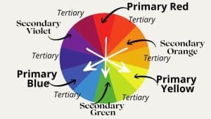
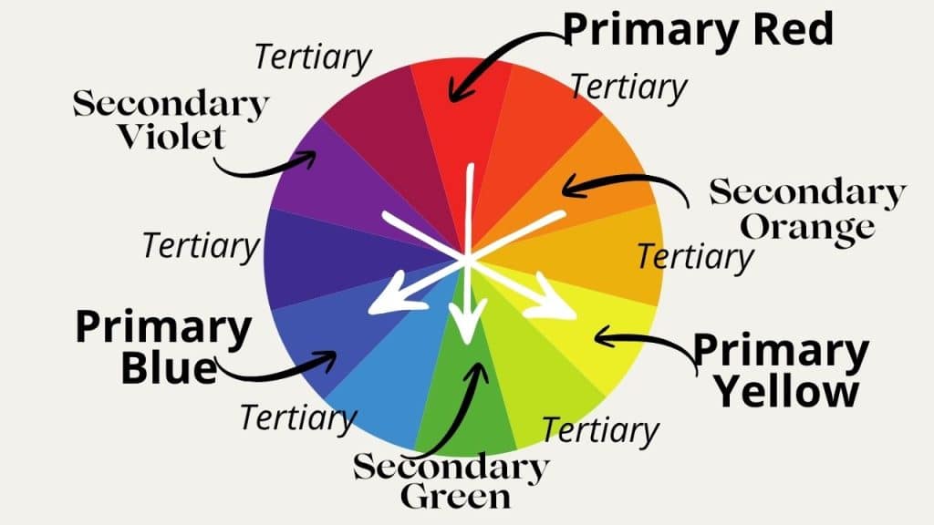
Tube black paint can feel harsh or flat. Mixing your own black or grey helps match the tone and mood of your painting—warm or cool—without killing the atmosphere. Therefore, I rarely use black these days, and prefer to mix my own darks or neutrals by combining colours which are opposite each other on the colour wheel – ie. Complementary colours mixed together – Red and Green, or Violet and Yellow or Blue and Orange. These all produce neutral tones.
4. Throwing in Every Colour You Own
Another beginner art mistake I made was chucking every colour at the page just because I could. Spoiler: it looked like mud. Stick to a limited palette. Now, when I approach an artwork, I spend a long time choosing a very limited colour scheme, and avoid the temptation to ‘throw in’ a colour because it seemed like a good idea at the time. When I think things through like this, it produces a much more harmonious piece with some intention behind it, not something that happened by accident or where I was ‘winging it’ the whole time!
5. Mixing Unrealistic Greens
Neon grass, anyone? Tone them down with reds or neutrals. A dab of the complementary colour (like red) softens overpowering greens. When you become more familiar with the colour wheel and the dynamic properties of colour. The process of creating realistic colours for landscapes, for example, gets easier. Soft greens are created using warmer colours (Cadmium Yellow and Ultramarine), whereas lime greens can be created from Lemon Yellow and a cold Blue (i.e. Pthalo Blue).
6. Forgetting Aerial Perspective
Distant objects lose detail and intensity. Misty mountains = less saturation, softer colours. Save the bold primaries for the foreground. My first challenge with creating aerial perspective came about with one of my earlier Acrylic artworks. I was trying to convey a slightly misty, ethereal look when I was painting St Michael’s Mount in Cornwall. I eventually took advice from an Artist who was running a demonstration at the Chelmsford Art Society. Every colour I’d chosen up to that point made it look like the Castle was plonked on top of a hill, like a large brick shed. It had absolutely no atmosphere. However, I was given some very useful advice by the Artist at the demonstration, which was to use the same colour of the sky, but tone it down a bit and make it more neutral. I achieved this by adding a tiny amount of Burnt Sienna to the blue.
7. Don’t Set your Expectations too High!
Don’t compare your Day 1 to someone else’s Year 10. Keep showing up, keep practising and working on your technique. Your creative voice will find its way through eventually. In my early Artist days, I was waaaaay too ambitious and overlooked the important basic steps needed to master watercolour. My excuse was that, as I’d come to art later in life, and wanted to paint something memorable. I wanted to ‘get there’ quicker. This beginner art mistake slowed down my progress massively, and not only that, I ended up not enjoying the journey very much. Who cares if there are other artists out there better than you? You am on your own personal art journey, not someone else’s. I have a much more relaxed attitude these days and actually enjoy experimenting and exploring an idea before I ever commit to it. It’s saved my sanity, I can tell you!
8. Don’t Guess the Vanishing Point
My buildings used to float in mid-air. Perspective isn’t a guessing game—use guides, grids, and resources (the books byTim Fisher and Adebanje Adelaja helped me tremendously). What I didn’t realise in the beginning was that if you follow the ‘converging lines’ of a building, i.e. the roof line, the top of doors, and windows, pavements and walls – these converging lines will all meet eventually. And where they meet – that is your Vanishing point, which is where you can draw a horizontal line to represent the horizon. These converging lines radiate from the vanishing point like the spokes of a wheel, and if you follow these lines without trying to ‘guess’ their angle, you will create a more realistic perspective for your buildings.
9. Use the Right Brush for a Flat Wash
Flat brushes are better for smooth washes. My skies used to look like someone dragged a rake across them—streaky and uneven. I could not work out why. But once I learnt how to use a flat brush by following the ‘bead’ of water down the paper, and then mopping up the bead so there wasn’t any danger of a back run or a hard line forming, I’d cracked it. Use a fully loaded flat brush to paint a big square, following the bead and mopping up any excess paint, usually produces a nice flat wash! Be wary of too much water, so a good mix of paint is required.
10. Don’t Make Up Your Colour Scheme as You Go
Planning your colours ahead helps set the mood and keeps things harmonious. Cooler tones = calm. Random guesses = an incoherent, clumsy, mess. I spent a lot of time now selecting my colours, in advance. This helps me refine the mood and the atmosphere without being distracted or side-tracked and going in a different direction halfway through a painting.
11. Leaving Brushes Sitting in Water
This ruins your bristles and causes the paint on the handle to peel. Clean and lay flat to dry instead. If you leave a brush sitting in water, the water will seep under the ferrule, and eventually the paint of the handle will start to flake off.
12. Don’t Spend Hours Watching YouTube Tutorials
Tutorials are great, but don’t forget to experiment. I eventually had to stop binge-watching and start listening to myself. My own voice had to come through, and that wasn’t going to happen if I was borrowing ideas from other artists, copying them or ignoring my own instincts or inspiration. Developing your own style takes time, lots of experimentation and practice. Yes, do learn and watch, but remember that you have a story to tell, if you give it a chance!
13. Giving Up Too Soon
Every artist hits the “messy middle.” Don’t stop there. Watercolour takes time—Rome wasn’t painted in a day. It is perfectly normal to have days when you doubt yourself, or feel you don’t have the ability or the talent. All artists, amateur and professional, have these doubts. Even well-known established artists like Lucian Freud and Claude Monet had the same feelings of disappointment. We artists care because creating and telling stories through our art is in our DNA. Humans have been creating for thousands of years. It’s part of our culture, so you would be forgiven for feeling a bit deflated if your art isn’t working out as planned. So, don’t give up yet. Who knows your best art is still to be discovered and explored!

14. Ignoring the Colour Wheel
I’d been painting for a few months when I bought a colour wheel, but had no idea what to do with it! In fact I put it in a drawer for at least five years before I could face looking at it again. This was a fundamental beginner art mistake because, EVENTUALLY, however, I had to grips with it so I took the time to learn how to use it, how to explore colour mixes, the role that complementary colours play in art – the Yin and Yang of colour. Understanding warm/cool tones and complementary colours was a game-changer. Call it your colour language. If you are armed with this knowledge, it will help you produce more variety, more clarity and help you avoid colour mixing mistakes.
15. Take Time to Explore and Experiment
I used to skip thumbnail sketches and colour tests to “get to the good bit.” Turns out, those prep steps are the good bit. In the beginning, I didn’t even know that most artists go through this ‘testing’ and ‘exploring’ phase before they even get the good paper out and commit to their art. In fact, it’s vital to plan, explore and muse over things. It’s the time to ask questions, get curious and get a feel for something. You might even get bored and change your mind and move onto something else! You might even come up with more than one idea. So, I have more than one sketchbook, and I use them for different topics and projects. Some projects stay ‘parked’ for weeks – even months – until I am ready to return to them. The infinite nature of art means that I never get bored, and never run out of ideas. ** I’ve listed a few Sketchbook ideas at the end of this Blog Post.
16. Don’t Use Cheap Paper
Cheap paper can ruin your progress. It’s not always you—sometimes it’s the materials. Upgrade your paper, upgrade your results.
Initially, however, when you are starting out, you might not want to splash out on expensive materials, especially if you aren’t confident in how to get the best from them. So, by all means, use Student Grade materials to start with, with the aim to ‘Graduate’ to better quality materials later on.
17. Remember to Use Contrast
A common beginner art mistake is to use too many mid-tones which produces flat, dull artwork. Don’t be afraid of the dark! It adds drama and focus. But contrast can also mean the contrast between a Saturated and a De-Saturated (i.e. toned down) colour. Sat side by side, they can complement one another, or the toned-down colour or neutrals will help the Saturated colour to really ‘pop’. Don’t be afraid to paint something purely from De-Saturated colours with the star of the show thrown in to create impact and drama. Nicholas Wilton said that a well-executed artwork incorporating good contrast is important, because good art makes people feel alive!!
18. Resist the Temptation to Paint Every Detail
In the beginning, I was a slave to detail, because that was what I thought I was supposed to do! I was ignorant of the role of Art. Art plays in evoking feelings, memories and creating mood and atmosphere. To transport us from our dreary humdrum lives! Can’t achieve that with an over-worked painting which has absolutely no personality or flair because you’ve shared every detail imaginable. You don’t need to paint every single leaf. Let the viewer fill in the blanks—imply the details. Less is more!
19. Leaving Puddles of Water on the Paper
Unless you want backruns, keep an eye out for little puddles. Blot with tissue or mop them up gently, or use a dry brush. Sometimes, though, you can just leave them there and let them become part of your artwork. Some artists deliberately try and achieve backruns as part of the overall effect.
20. Use Clean Water
Cloudy water = muddy colours. Refresh your rinse water often, especially when switching between warm and cool shades.
21. Saying Too Much
You don’t need to explain everything. Sometimes, suggestion speaks louder than precision, lessif more!
22. Remember to Balance Your Colours
Save bold colours for the areas you want to stand out. Let neutrals do the heavy lifting elsewhere. They help make your feature colours ‘pop’. Also remember to think about the colour temperature, the mood and atmosphere you are trying to evoke. Think about the colours that would be most appropriate, what role they will play. Maybe do some colour swatches first, look at which colours go well together, which combinations produce the effect you want to achieve. Test these ideas out before you commit to the paper, to avoid disappointment later on.
23. Don’t Skp the Focal Point
Without a clear focal point, the eye wanders. Ask yourself: Where do I want people to look first. If you use the ‘Rule of Thirds’ by dividing your paper into 9, you wil find the sweet spot which is the ideal location for your focal point.
24. Don’t Leave your Personality Out of your Art
Your quirks and style are what make your work yours. Don’t hide them. One thing I discovereisit that, if I wanted to create reality, I can simply take a photograph. Whereas, conveying what’s in my heart, what’s important to me or to suggest an atmosphere or mood, that can only come from my own observations and experiences. Sharing my personal interpretation on something has far more meaning than trying to copy what someone else has painted. Do not under-estimate how you see something and have the courage to show up and share!
25. Treating Mistakes Like Failures
They’re not. They’re evidence that you’re learning. There were numerous, countless times when I wanted to throw in the towel, but once I’d picked myself up and had a think, I pressed on. With each artwork that DOES work, it will give your confidence a huge boost. So celebrate each tiny win and keep going!
🖌️ Final Thoughts
Mistakes aren’t the enemy. They’re a sign that you’re experimenting, growing, and putting in the work. Take this list as a friendly nudge from one artist to another: you don’t need to get it perfect—you just need to keep going.
💬 Have you made any of these mistakes? You’re not alone. Let me know in the comments—or share which ones surprised you the most.
🛒 My Favourite Art Supplies & Inspiring Reads
I only recommend materials and books I actually use and love — these are staples in my art practice and mindset.
- Canson Spiral Mixed Media Sketchbook (7×10″) – affordable, reliable, and ideal for daily practice
👉 https://amzn.to/49uBjnM - Stillman & Birn Sketchbook – thicker paper, perfect for watercolour and mixed media
👉 https://amzn.to/3B5X4h5 - Seawhite A4 Watercolour Landscape Sketchbook – great quality paper in a wide format, perfect for loose landscapes
👉 https://amzn.to/4f4iXeC - Strathmore Visual Journal (Mixed Media) – durable and versatile with a lovely paper texture
👉 https://amzn.to/3ZkgYwA - The Addictive Sketcher by Adebanje Alade – inspiring book by a passionate artist with amazing energy
👉 https://amzn.to/4o6dBoU - Perspective Drawing Handbook by Joseph D’Amelio – clear, practical guide to mastering perspective
👉 https://amzn.to/451gxu7 - Drawing Perspective by Tim Fisher – beginner-friendly guide with practical exercises and tips
👉 https://amzn.to/44I0zpT